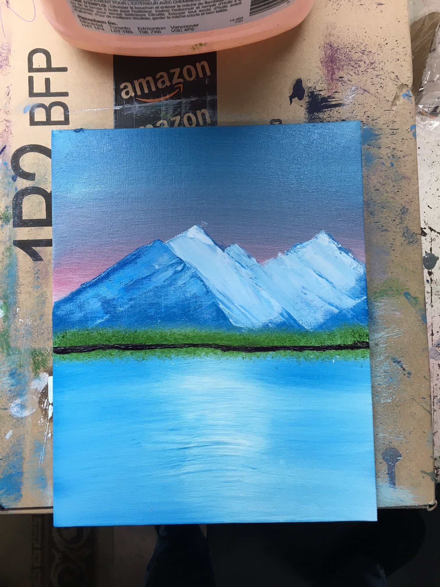
The Bob Ross Technique! Newest paintings are first, older paintings further down the page. A lot of these paintings are total rip-offs of Bob Ross paintings!
Notes:
- I like painting tree trunks with the knife
- I prefer trees with a fan brush
- I suck at lighting/highlights and foregrounds
- I like my mountains, but they do tend to be a bit boring
- My most success with clouds so far have been painted with a 1" round brush, the bottoms tapped to "fluff" them, and then blended VERY lightly across the sky with horizontal strokes (painting 11).
- It is easier to paint on a medium/large canvas than a small one - don't be cheap!
- Do not go overboard with applying paint to your brushes - especially with skies! My earlier skies tend to be very dark. TAP the bristles in the paint to load them.
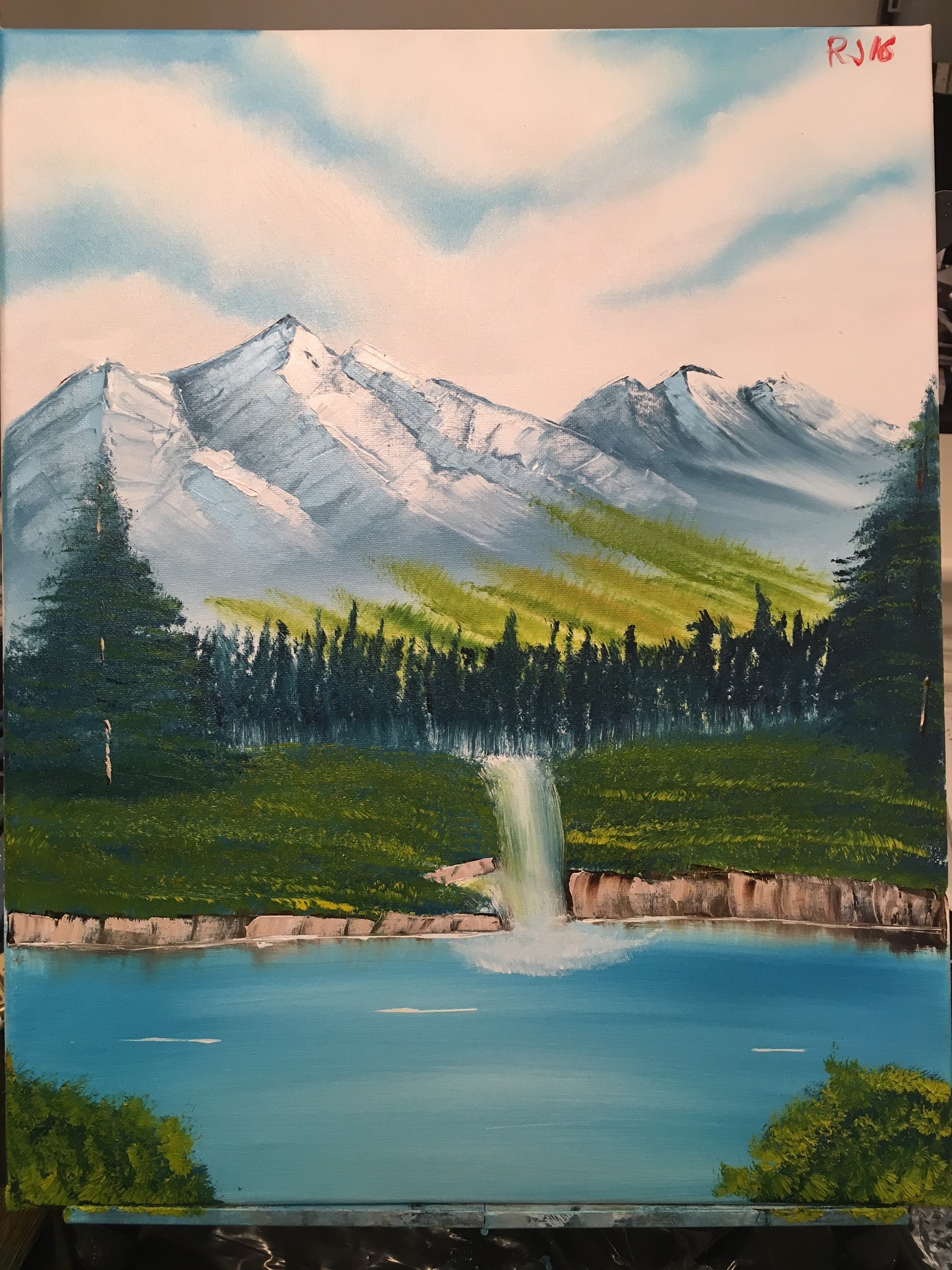
BAH. Not a huge fan of this one, either. 9 weeks in between this painting and my last, so I sort of had to rip the band-aid off, right? I dislike my shoreline and the grassy area, my middleground trees' trunks are too high, I should have left more room between the two halves of grass on either side of the waterfall since I picked up a lot of paint when I did the waterfall itself. My far mountain (on the right) actually looks okay, but it's hard to see where the two mountains separate. The far, lighter trees came out better than I expected, although my strokes upward with the 1" brush were a little too much - especially on the right side. Like the alternating colours though! My sky is unremarkable, I wish I had brought it down a little bit more towards the mountain - there's so much white! And the clouds look a bit unnatural, I should have added a bit more blue to that sky. Actually I guess it's not terrible, but it felt like starting fresh again in a way. I'm hoping painting 16 will come a bit sooner than 15 did!
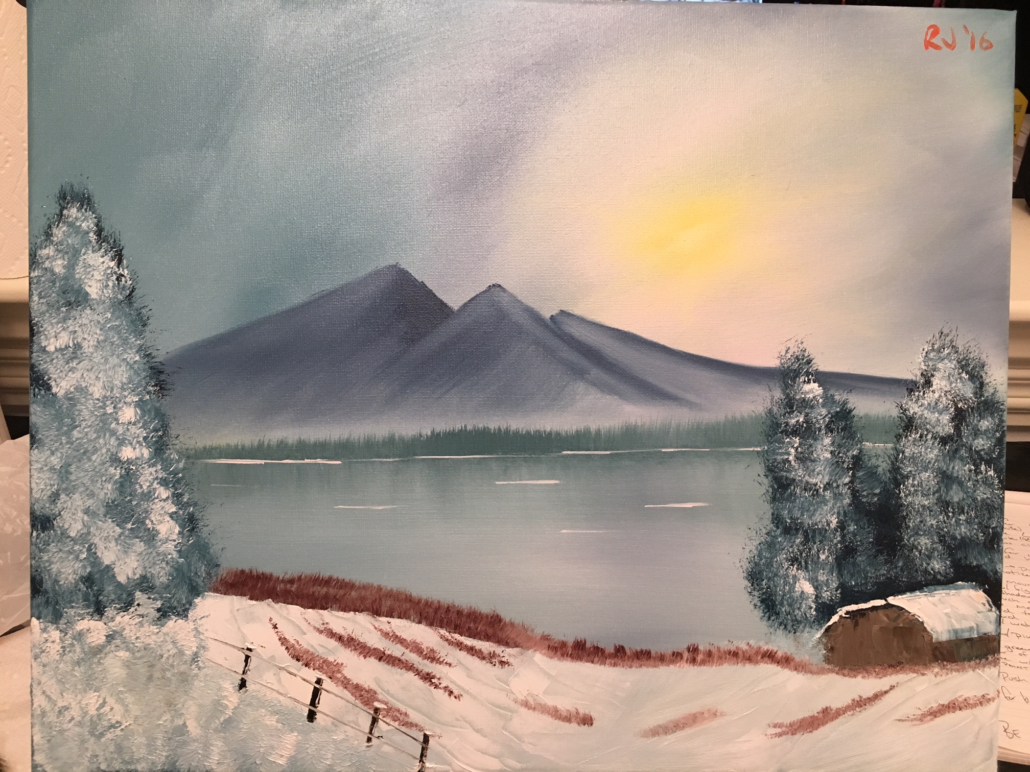
I am a little disappointed with this one if I'm honest. My sky looks okay but I think I went a bit too far with the blending. My barn on the right side came out okay, and that was the main thing I wanted to try with this painting. It looks a little short, but not terrible. My trees on the right look okay, but my tree on the left looks a bit smudged. Also, what the flying hell is going on in the bottom left corner?! It's just smudges. I wanted bushes and foliage. My fence looks better than I thought it would! My grass was done using the fan brush and doesn't look too bad for the most part. I just wish the left side of the painting turned out better, but it just looks all smudged! My background doesn't look bad - it looks pretty much like what I was going for. Here is a link of the Bob Ross painting I was trying to copy!
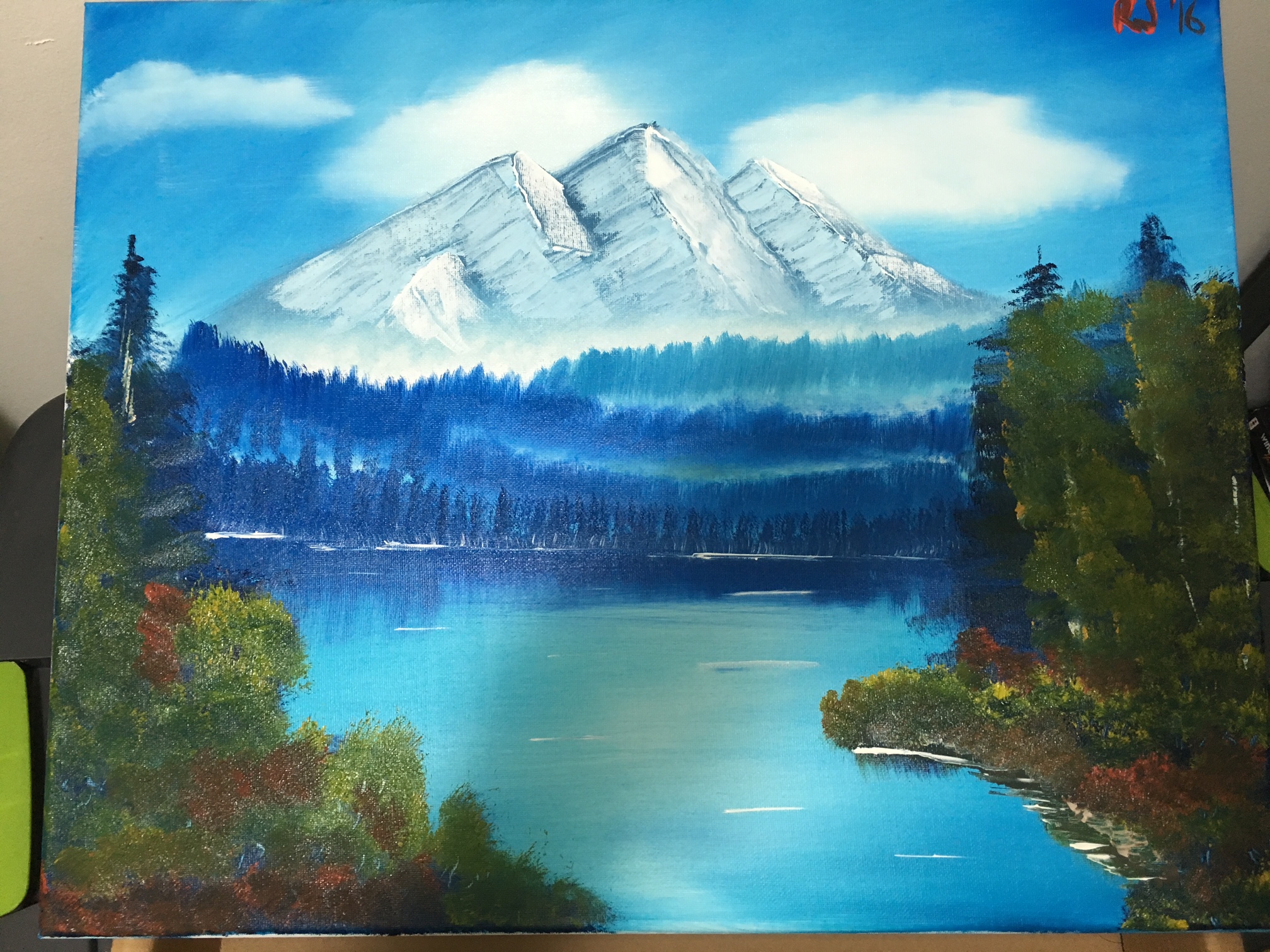
I found an hour long Bob Ross instruction video for the painting "grandeur of summer", so I thought I'd give it a shot! I really like my cloud on the far left, the other two clouds look okay. You can see a bit of horizontal smearing from when I blended it - I NEED TO USE LESS PRESSURE. Mountain looks okay but unremarkable. My background trees look alright, but the mist didn't come out as well as I hoped it would. I also don't like the colour I used for the furthest back trees. Too green. I went out to Michael's and bought Indian Yellow and Yellow Ochre - two paints I never had before. I think my foreground looks okay in the sense that I got the nice "leafy" look with some of them - one of the things I really wanted to work on. My water reflections look a bit odd because I forgot to take care of them before working on the foreground. My water lines are too thick. My shoreline on the right looks sloppy and weird. But again, I really like the colours in the foreground! I wish I could find a tube of Bright Red paint to help with the foliage colours - I used Cadmium Red to brighten some of them up instead and that turned out alright.
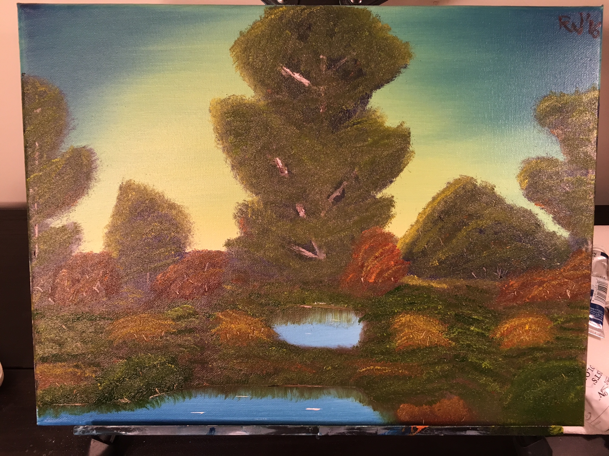
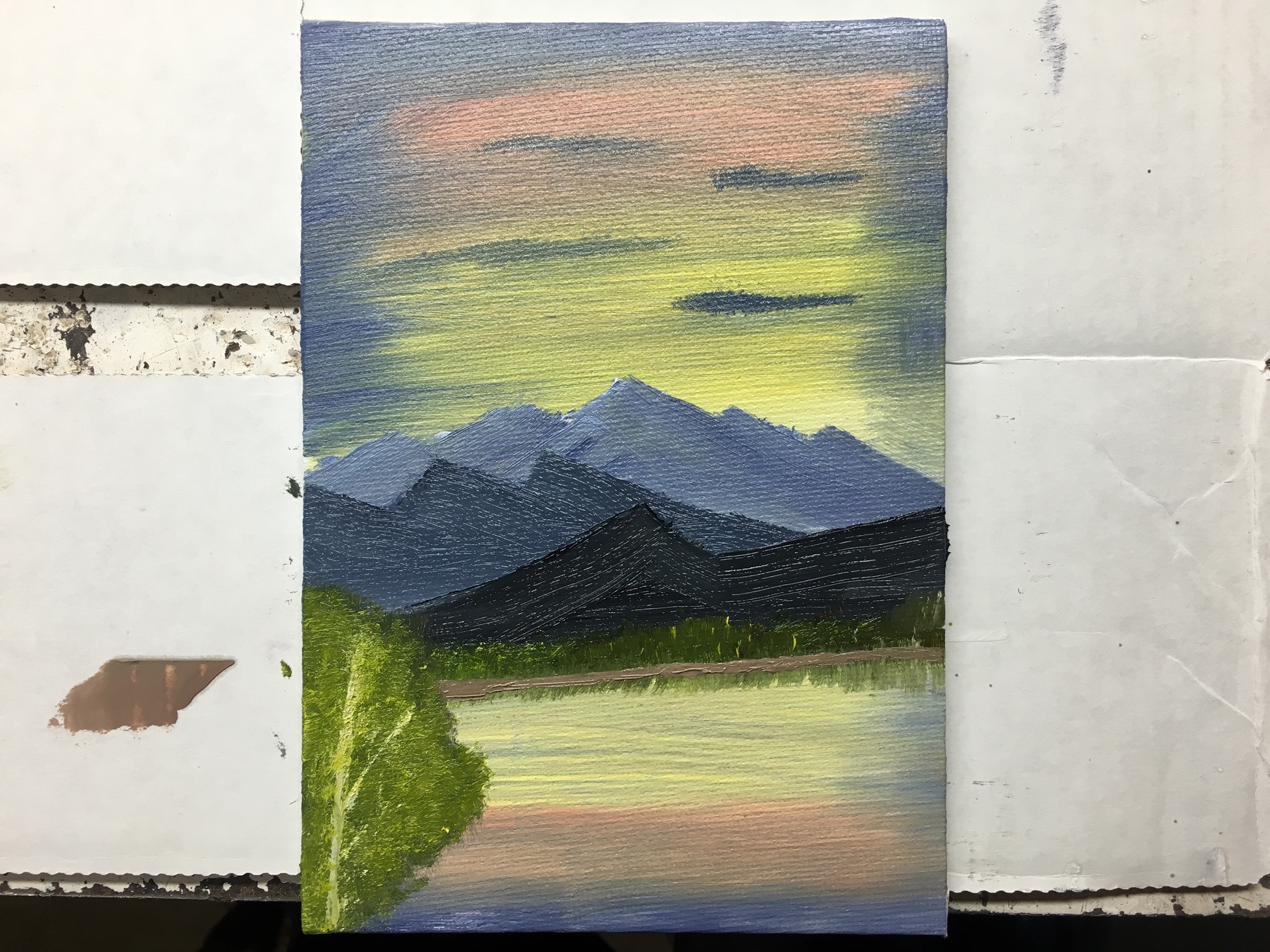
I'd like to give this painting another attempt, especially since it was my first painting in almost a month (I moved out into my own apartment during that span, so I was pretty busy!). So yeah! I will try this same scene again. I actually might revisit a few of the scenes I've previously painted to see if I can't improve them. This painting doesn't look terrible though, does it? It's much better than the foregrounds I did in painting 7, which were sort of the same idea. Oh! And I apologize for the big shadow in the middle ... that was my hand taking this picture!
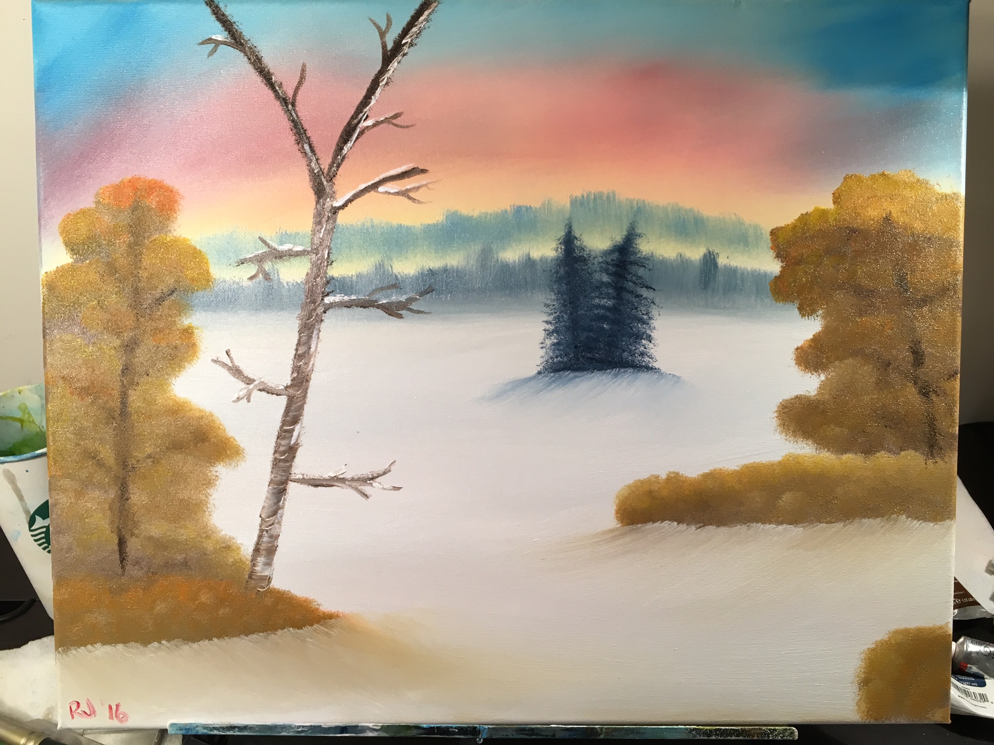
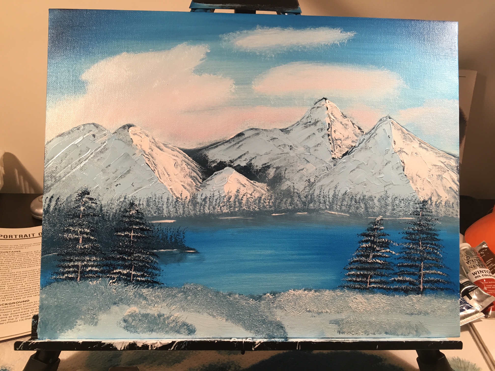
This one actually came out looking okay. I love the colours in my sky, although I wish I had gone further to the edges with the reds and yellows rather than surrounding them with blue. My waaay in the background trees look a bit weird they way I did them, but at the same time they don't look too far off Bob's. I really like the shadows in my snow. The evergreens in the middle look good - especially when I decided after taking this picture to add some snow highlights to them. My foreground trees look a bit weird - the "leaves" just look like smudges. I don't like the trunks as much either, but they're not terrible. My naked tree on the left, just like the previous painting, looks off. This was my first painting on a much larger canvas! One observation I have made - small canvas are more challenging to learn on than bigger canvases. Things are more finicky on a small canvas, and it's easier to fix things on a larger canvas. You can be a bit "sloppier" without sacrificing quality.
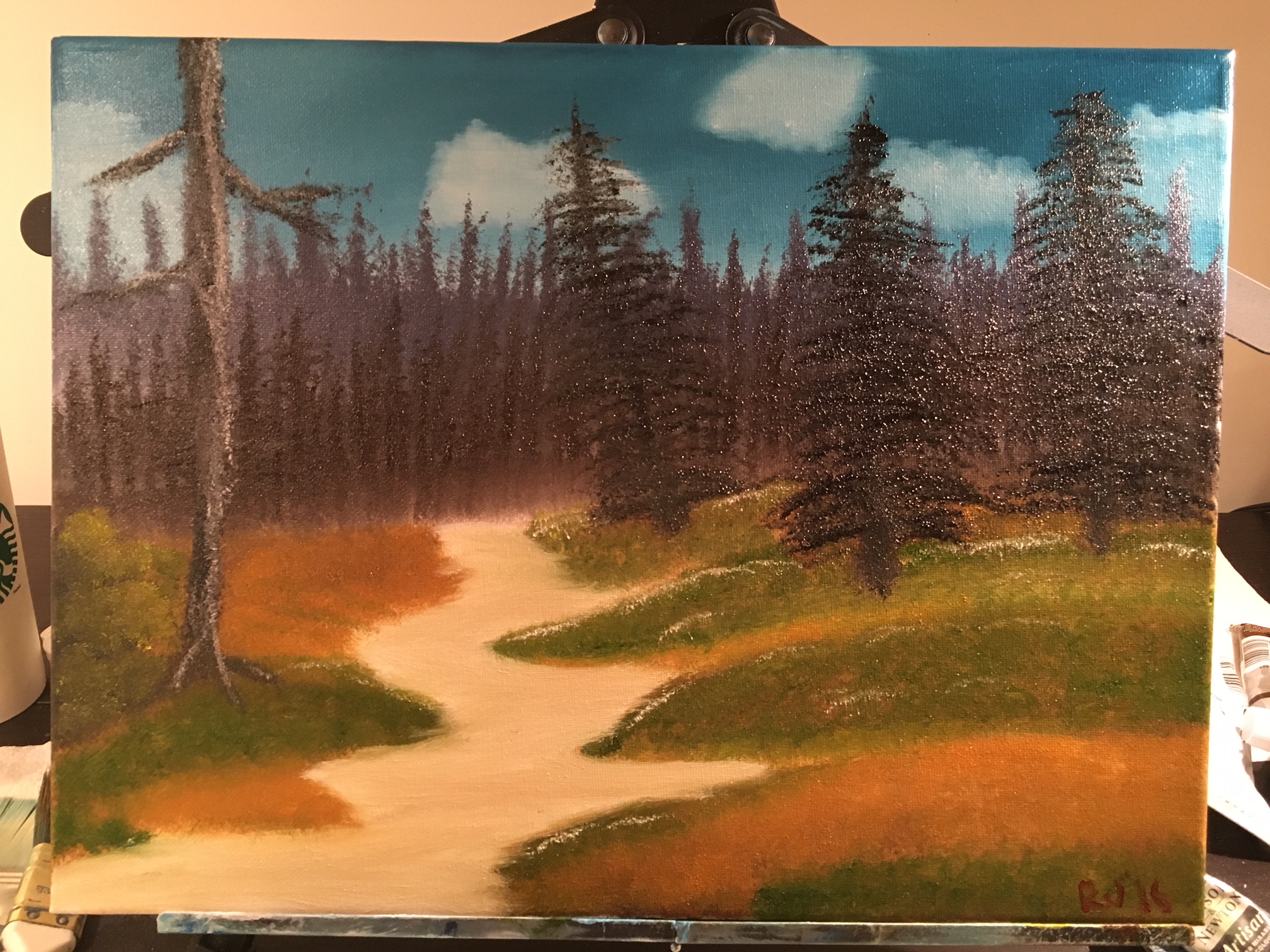
My favourite part of this painting is the sky and clouds. This is my first sky/cloud combo I've actually really liked! The background trees look good, but I wish I had made the closer layer a bit lighter because the trees in the foreground don't really look dark enough despite the fact they were almost entirely black! My tree trunk on the left I didn't like. I didn't use a knife and I think that was a big mistake. Path looks okay, grass looks okay, but again my highlights just look a bit... off.
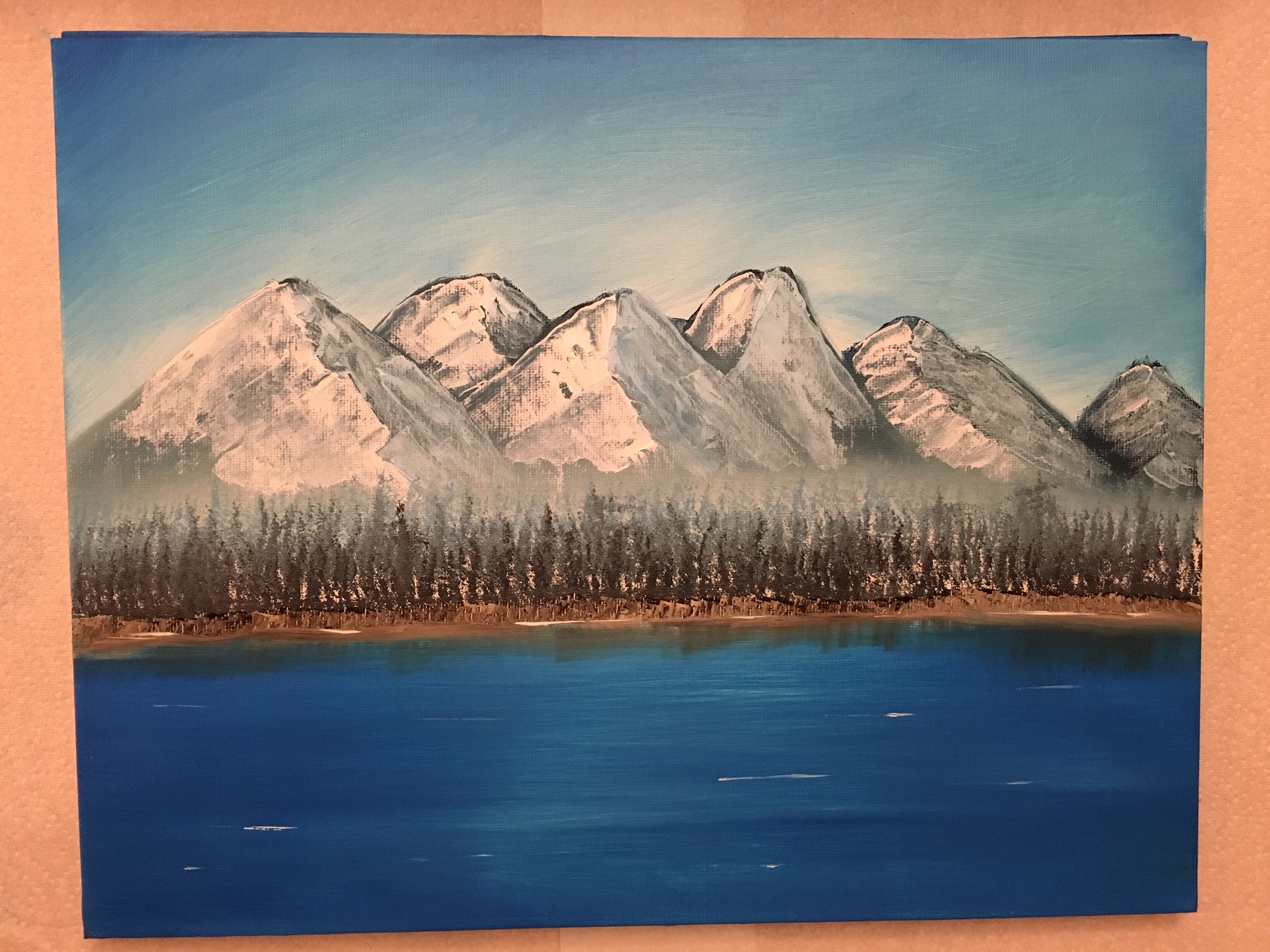
I did this painting very quickly because I couldn't sleep one night. Plus I hadn't done some mountains in a while and felt like 'brushing' up on them a bit - see what I did there?! Anyways. My sky looks a bit strange because I thought I'd try fading it out closer to the mountains, but it didn't really turn out the way I wanted it to. Mountains look fine, and I love the mist at the bottom of them. I tried putting in two layers of trees at the base and they came out okay. The shoreline looks a bit odd - I thought I'd try something different and used the knife with a marbled paint. Pretty unremarkable - again, I was just sort of killing time!
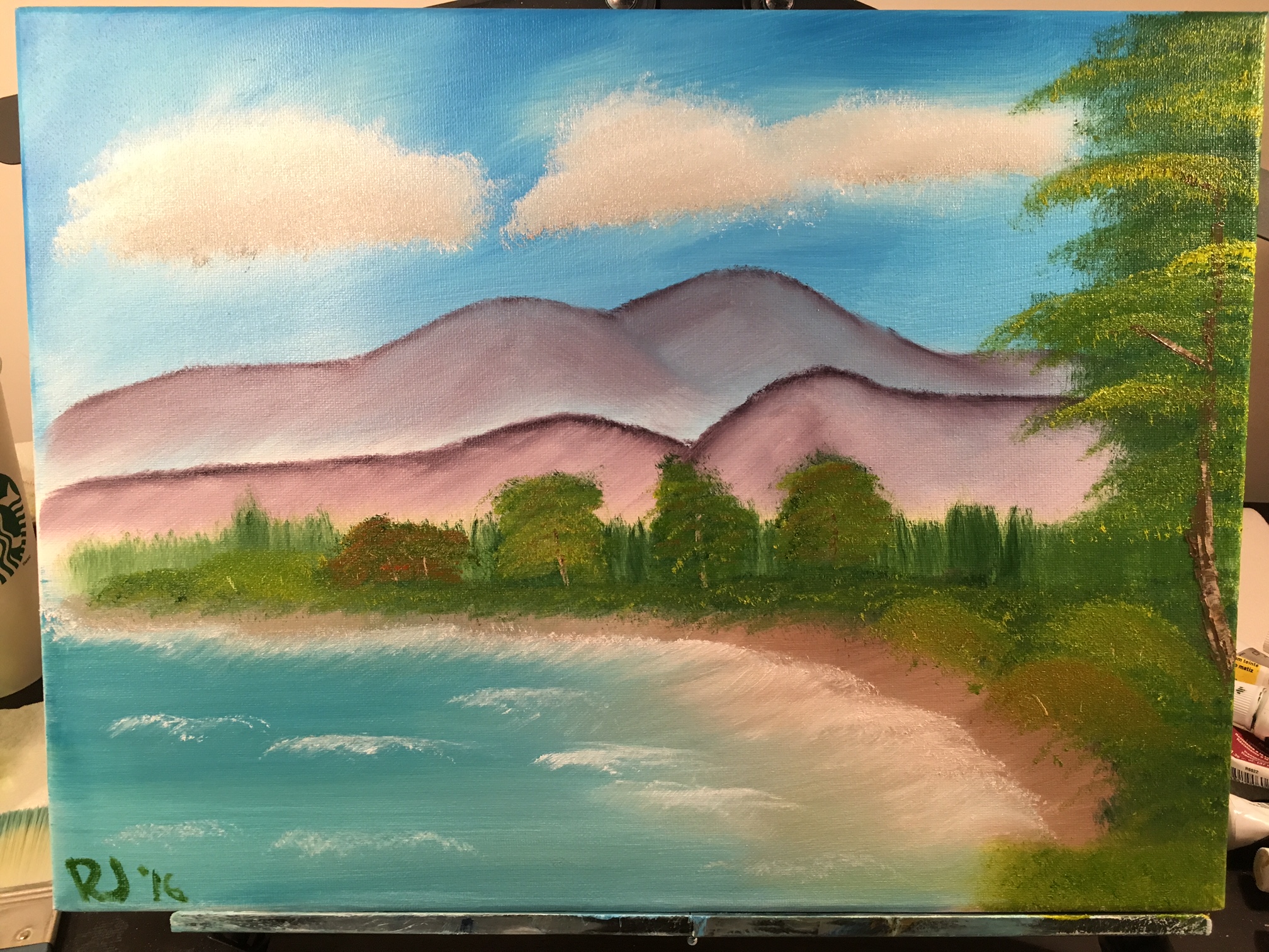
Named this after my friend for fun :P My clouds don't look fluffed enough but I like the colours. My mountains look a bit strange - the dark edges are too thick and the mist isn't prominent enough. My trees and bushes in the middle of the painting look sloppy and blah. But! I really like my beach, the brown/sandy water, the waves, and the tree on the far right of the painting! For some reason I always forget to use the knife to paint in tree trunks before I apply highlights. Here I didn't forget!
This is the first painting I did that I was actually pretty proud of. My mountains, although plain, look okay. I have a good looking mist at the bottom of the mountain! That was a big win for me. My trees look good (although the trees on the left are much shorter than the ones on the right... I admit that looks a bit strange) and my snow/path look okay. Snowy bushes look okay too. I think I overdid the red in the sky, though.
Inspired by the previous painting I thought I'd work on foregrounds. I don't know what I was thinking. I hate this painting. I don't even know why I'm posting it, lol. My tree trunks look weird, the foreground still has the "green zebra" going on, the sky looks weird, the sticks look weird, EVERYTHING LOOKS WEIRD.
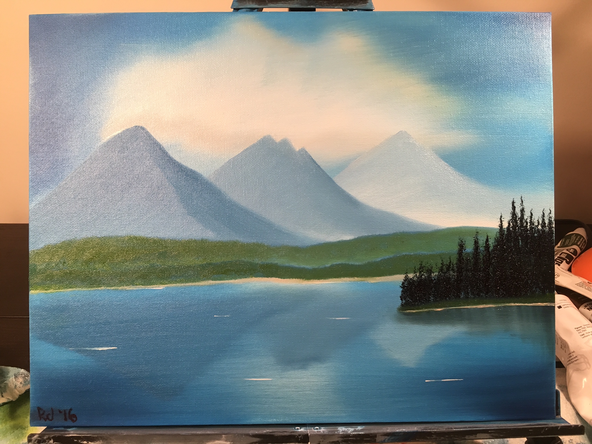
This one is very simple - the main goal was trying to reflect the mountains in the water and incorporate some mist. The mountain reflections I like (I did the actual reflections with a fan brush), but my mountains ended up with no mist - I used too much paint. I tried to put some mist in the grassy hills, but blue shows through because I covered the entire canvas with pthalo blue. I should have left a white space! I like my trees on the right side, too! Cloud looks better than before, but still a bit weird. And ... like, really huge. lol.
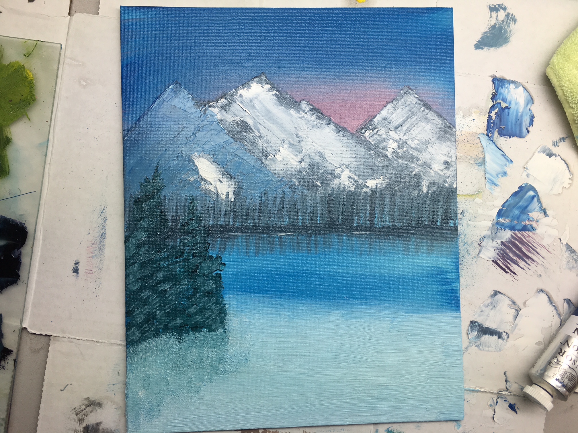
This was the first painting I did after getting some tips from my uncle. My mountains look much better! The clouds weren't "fluffed" enough - should have blended the bottoms, blended up and then blended across. My snowy foreground trees look pretty good, too! Learned that water lines NEED to be completely horizontal or they just look wrong. My bushes in the foreground are all smeared ... foregrounds definitely something I need to figure out.
